THE SEA BEAST
PRODUCTION DESIGNER
PRODUCTION DESIGNER
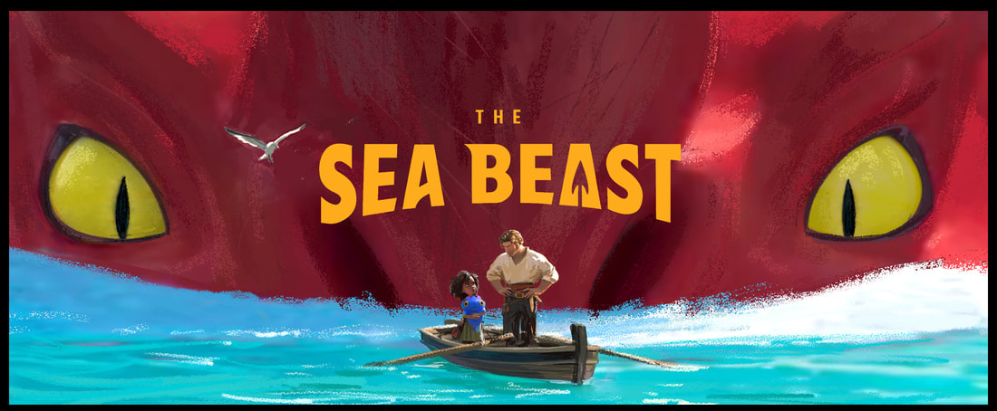
In 2019 Chris Williams pitched me an idea that he was working on. A story that he had wanted to tell for a long time - It was set in a world with giant sea monsters and monster hunters. His original inspiration came from the Sea monsters that map-makers painted in the areas that weren’t explored yet.
Chris had just moved from Walt Disney to Netflix Animation and I joined him there soon after. It was going to be a journey into the unknown for all of us.
Chris had just moved from Walt Disney to Netflix Animation and I joined him there soon after. It was going to be a journey into the unknown for all of us.
Inspiration
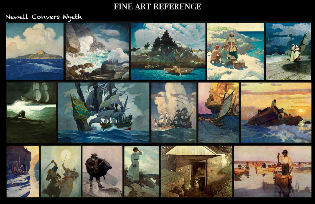
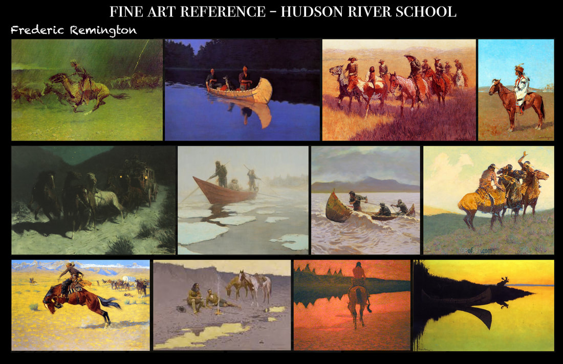
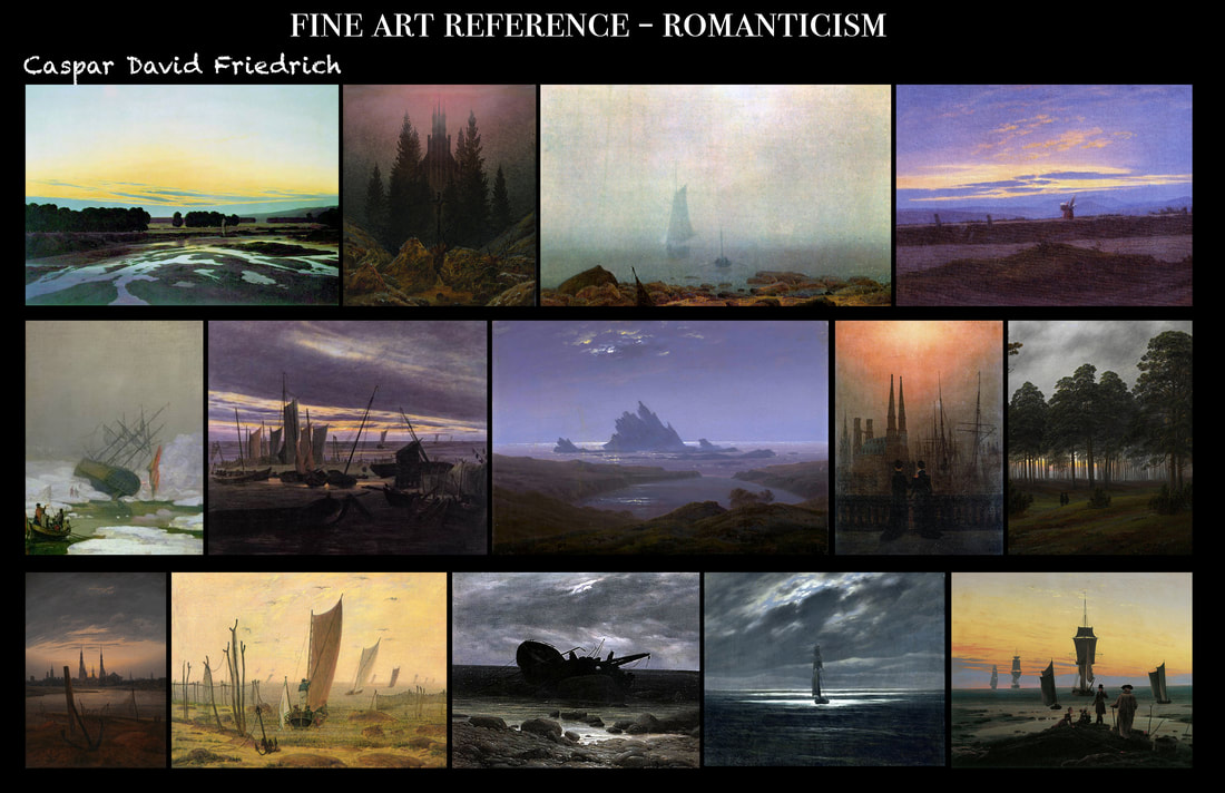
It is often helpfull to look at fine art for inspiration when deciding on a visual style for a new project. We wanted the world to be believable and immersive for the audience so it was important that the style would not be constantrly "noticable" and act as a filter between the the action and the viewer. But even though we knew the render-look would be more photo-realistic we found a lot of sollutions and inspiration in the work of fine artists.
When I arrived, Cris had already a lot of N.C. Wyeth’s illustrations on his wall : The sense of adventure, the way he draws clouds and sails is spectacular
I love the Painters of The Hudson River School - and Remington in particular. The bold use of vibrant color in natural settings is something I wanted to implement in the look of our film
I’ve always been a fan German romanticism and Caspar David Friedrich. His paintings are actually quite large and create a truly cinematic scale.
Creating the Style
We set out to find the perfect balance between realistic style, while keeping the fun and charm of the classic animation movies. I will explain our choices with the help of some still images from the movie:
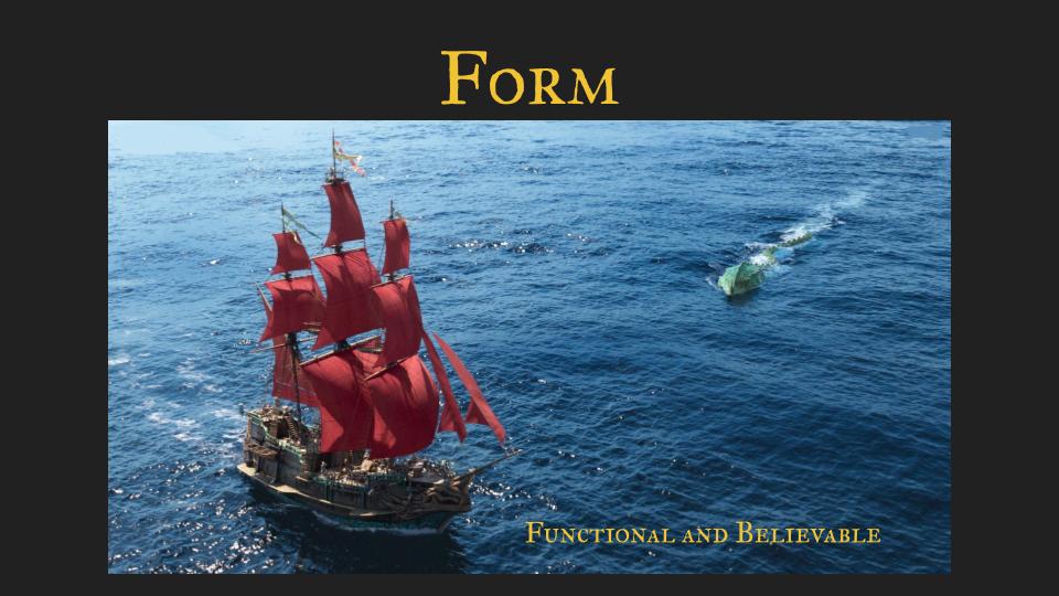
I wanted the world to be believable - The ships are fully functional and generally shapes are not exaggerated. Scale is very important in this film and a connection to reality helps the audience to grasp the size of objects and spaces easily.
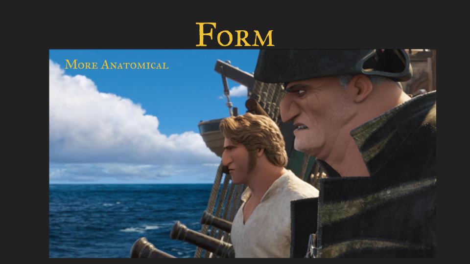
The Characters are not realistic or motion captured but also not squashy or exaggerated like typically in animation. The eyes for example are less oversized, the animation is more controlled.
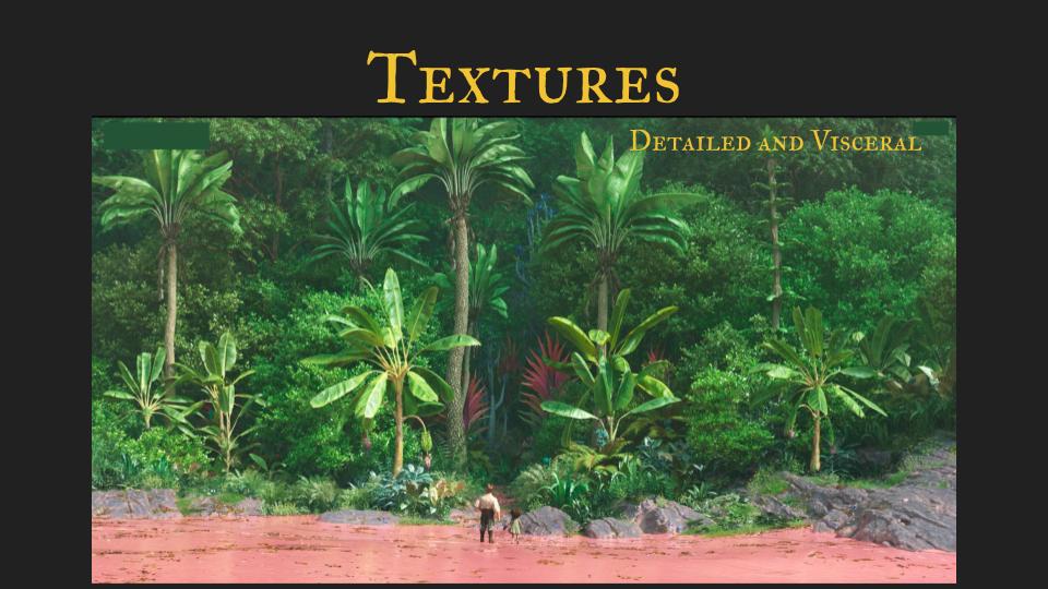
The texture are detailed and realistic - We took some liberties - for example simplifying the human skin a little bit to avoid the uncanny valley - when things get uncomfortably realistic.
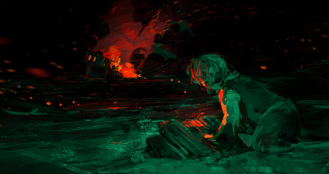
Colors are set up as strong themes during the movie in a color script: The theme of seeing the world in terms of “us and them” is illustrated as Red versus green already in the opening shot.
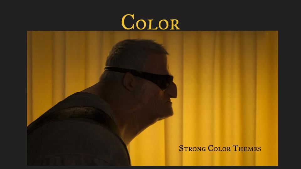
This image shows another color theme that is introduced half way into the movie: The use of yellow for aggression and revenge.
This image shows another color theme that is introduced half way into the movie: The use of yellow for aggression and revenge.
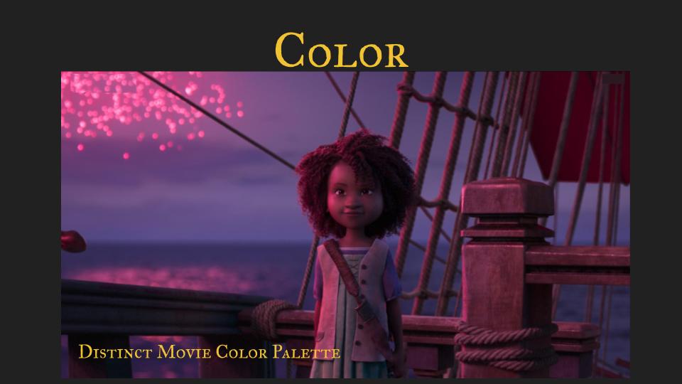
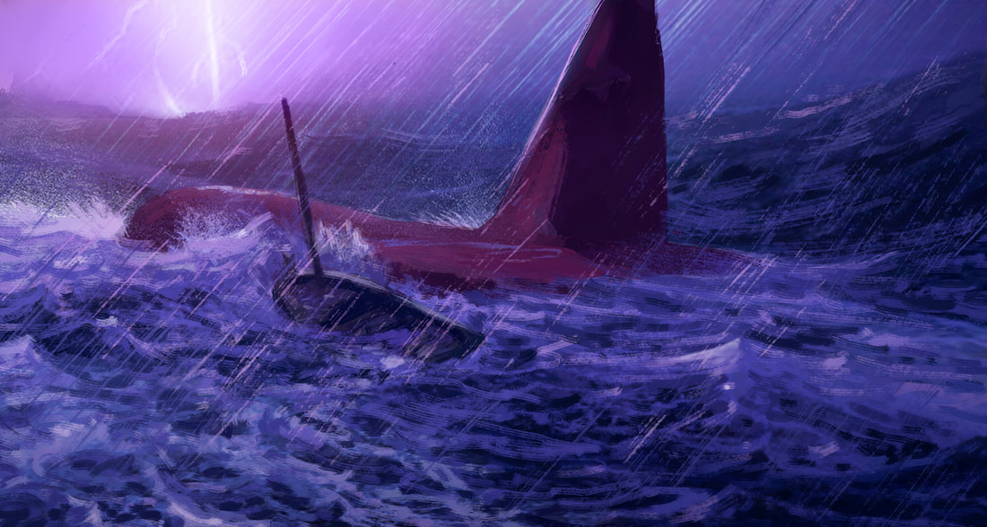
Maisie often brings a lavender tone with her. This color is set up in the beginning when she imagines being a hunter and it returns when she is confronted with the reality of an actual sea monster hunt.
Colors choices are not only used to suport subtext or emotions. They also give the film a specific look over all. The hope is that if someone sees a single frame of the movie they can identify the whole, just by its use of color.
Colors choices are not only used to suport subtext or emotions. They also give the film a specific look over all. The hope is that if someone sees a single frame of the movie they can identify the whole, just by its use of color.
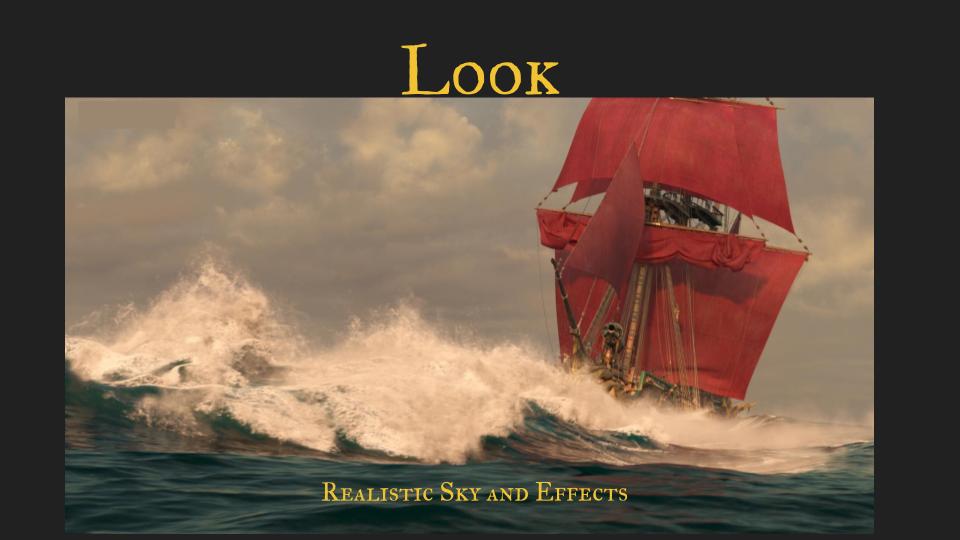
Sony-Imageworks (our vendor studio) did a fantastic job with the water effects which adds so much believability. We tried to stylize the sky in the direction of N.C.Wyeth first. But we realized that it needs realism for the world to feel vast and open. Painterly clouds would have drawn attention to them and that breaks the immersion.
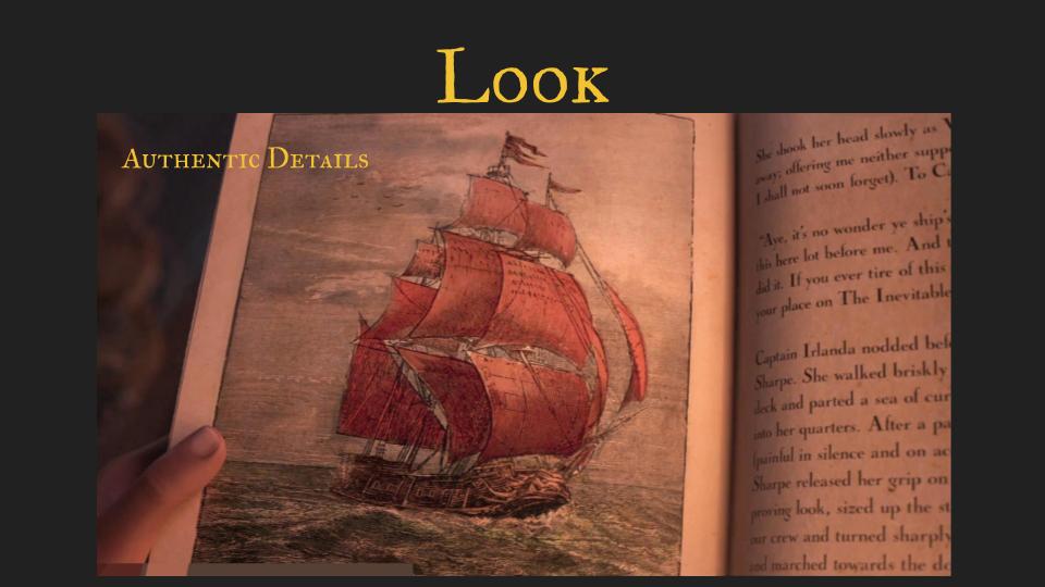
Wherever possible, we were authentic and true to the period even in the details like the wood prints in the book illustrations. (The "wood prints" were done in Photoshop by Estefania Pantoja)
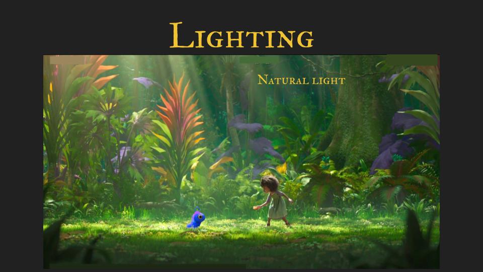
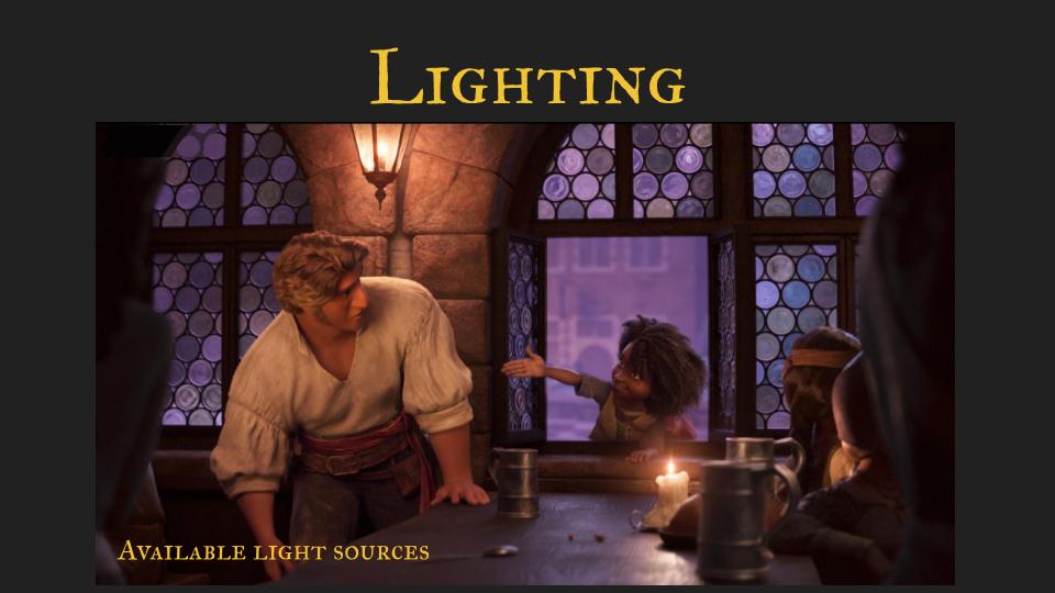
I wanted this film to feel lit with natural light to ground it in reality - especially in the fantastic parts.
It was important to me to light the scenes with available light sources to make sure the sets didn’t look staged.
Pre-Production
To be honest, we hit the floor running. Often people think, that the Production Designer creates the bulk of the artwork. That is usually not true. As soon as production starts there is not much time to sit on your desk and paint beautiful pictures. The majority of time is spent either in meetings or guiding the Artists around you. The main point is to have a strong vision that supports the director's intent and communicate that in a million ways every day. Finding the right reference for an artist, explaining the emotions and psychology and what that means for the imagery, Creative input in all aspects of the pipeline - from storyboard to lighting and color-timing, Always with the final result in mind.
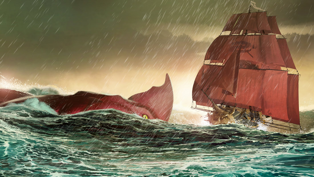
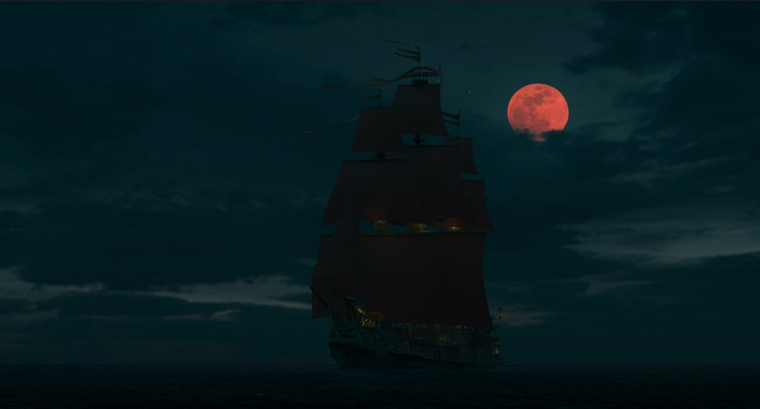
So here are some early concept paintings. Giving the ship red sails was one of my very first decissions.We needed a clear identity that can be seen from far away an red tanbark was actually used to protect the sails against sun dammage.
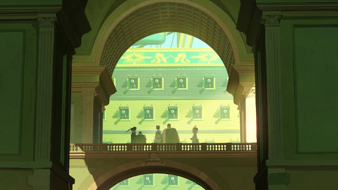
It was also an early idea to have some kind of set for the royals playing architecture against the ships in an interesting way.
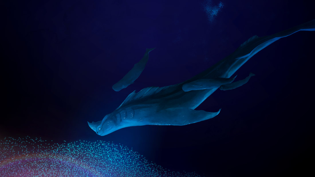
We ran into an issue with our main red beast: Red is one of the first colors that gets filtered out by the surrounding water. Considering the scale (see the small whales surrounding the sea beast) we would have to be so far away that the red color would be entirely swallowed. Not what we were hoping for: In the movie we cheated the red back in
Production
This is a rough color key for the opening scene of the Sea Beast. The green of the night (inspired by Remington) against the red of the burning ship - and the fact that these are the only colors - prime the audience to the importance of these two colors in the film. ( I can only do this because this color-scheme supports the emotion of the scene of course)
Lavender is not a typical choice for scary action. At this point we have already been through a epic battle in this color-scheme and the audience has accepted the association with danger.
This is painted over a lighting render. These are quite common to guide the lighting department for final adjustments.
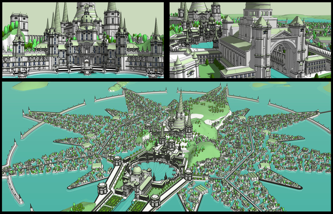
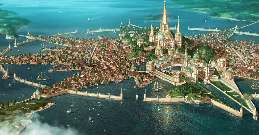
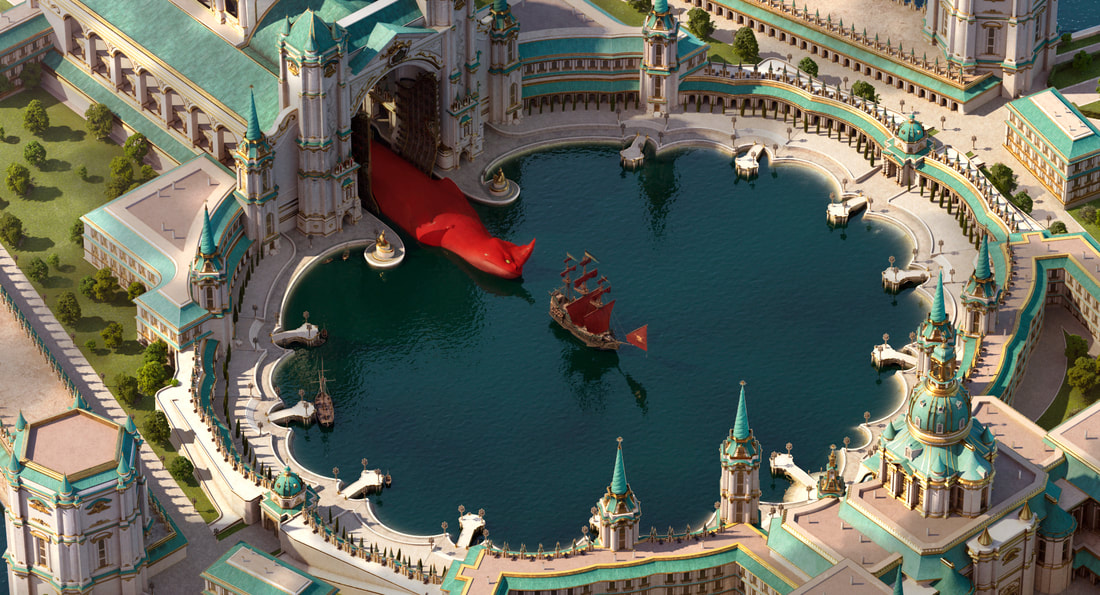
The royal palace and the surrounding city was one of the largest sets I ever created. I built it first in Google SketchUp and then broke it up into pieces to give to the artists who worked on the detail. Everything in this city is designed to be accessed by ships and boats. The ocean is central to this kingdom. The shape of the city resembles a compass rose on a map and the palace is the center of the known world.
This piece of concept art goes together with the model above.
This is painted over a lighting render. Scale was very tricky in this environment. The castle is huge, the monster is huge but at the same time it still has to work for actual humans.
Baroque was the perfect style for the architecture. Not only is it true to the period but the controlled gardens are the perfect counter point to the wild nature in the world of the sea beasts. The lavish ornaments are also a welcome visual for the display of excessive concentration of wealth.
Baroque was the perfect style for the architecture. Not only is it true to the period but the controlled gardens are the perfect counter point to the wild nature in the world of the sea beasts. The lavish ornaments are also a welcome visual for the display of excessive concentration of wealth.
This is a fly-through WIP render of the entire castle area. It's not a scene in the movie and it has generic lighting and sky-dome. It gives you a sense of the detail in this set though.
And then...
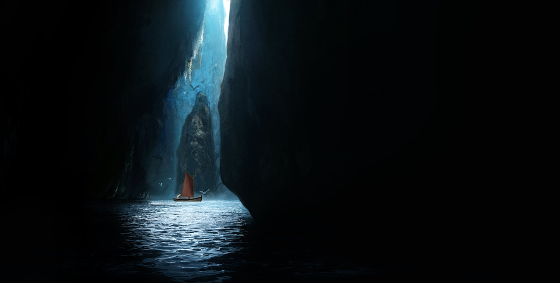
There are always sets that end up on the editing room floor because the story changed in production. The "Mondrous Narrows" didn't make it but I still like the painting. This was for one of the darkest and most hopeless moments of the film and I wanted to try how much actual "black" on screen I can get away with.
